chevron_right
chevron_right
Big Data Analytics - How It Works
Informational/Resource

Big Data Analytics - How It Works

Last Updated a week ago
Article Navigation
Introduction
Overview
Video
Tips and Best Practices

Introduction

Welcome to our comprehensive guide on Big Data Analytics within the Ezoic platform. In this article, we will delve into the intricacies of how Big Data Analytics functions and the wealth of information it offers to Ezoic publishers. Whether you are looking to analyze data across multiple sites, compare performance metrics, or drill down into specific user behaviors, this guide will provide you with the insights you need. We will cover various aspects such as the Big Data Analytics dashboard, available reports, utilizing segments, and adding filters. Our aim is to equip you with the knowledge to make data-driven decisions that can enhance your site's performance and user experience. 

Overview

The Big Data Analytics Dashboard in Ezoic provides a comprehensive view of your site's performance across multiple dimensions. Below is a detailed breakdown of the various features and sections available:

Sites

In the Big Data Analytics section, all of your sites using the Ezoic platform are listed at the top right corner. You can view analytics for one site, multiple sites, or all sites collectively.

Platforms

The 'Platforms' option allows you to select the source of the data: your old site (pre-Ezoic), just the Ezoic platform, or both. Make sure you have the correct platform selected when viewing any data.

Favorite

You can add individual reports to your favorites by navigating to the relevant report and clicking the 'star' icon at the top right of your Dashboard.

Help

For further assistance, click the ‘Help’ button and use the search bar to find relevant support articles.

Search

Use the search bar to quickly find the report you are looking for.

Reports

The Reports section covers various metrics and aspects of your site. Please note that the availability of certain reports is restricted to publishers using the relevant apps. All available reports are as follows:

Insights

  • Ezoic VS. Original: Compare the performance of the Ezoic version of your site against the original version.
  • New Content: Analyze the performance of content created in the past six months.

Real-Time

View key metrics in real-time, including 'Active users on site', 'Pageviews & Projected Revenue', 'Top Active Pages', 'Top Referrals', and 'Top Locations'.

Revenue

  • Revenue Overview: Divide your revenue data into daily, weekly, or monthly metrics, or choose a custom date range.
  • Revenue vs. Last Year: Compare current revenue data to the same period last year.

Traffic

  • Traffic Overview: View traffic on a daily, weekly, or monthly basis, or for a custom date range.
  • Traffic vs. Last Year: Compare traffic data to the same period last year.

Experiments

Track the success of various 'experiments' conducted by EzoicAds' machine-learning technology.

Audience

Get an overview of user demographics, languages, locations, and how these factors relate to revenue and user experience metrics.

Language

Here you can see a breakdown of the languages that your users speak and how this relates to your key revenue and user experience metrics. For more information on the language codes used, you can visit this site

Location

This section will display a world map that indicates the density of where your users lie. The darker the color, the higher the concentration of your users in those locations. So, in the example below, we can see that the highest number of pageviews come from the darker blue sections, you can then use the drop-down in the top-left to see how this changes when different metrics are selected. 


Local Times 

This section can be looked at in one of two ways:

  1. Local day of the week
  2. Local hour


Local day of the week looks at how your users interact with your site on each day of the week, for example, you could compare how your bounce rate differs from Mondays to Fridays, like in the example below:


Similar to local day, the local hour metric looks at the most popular times (based on your users' timezone) that users are engaging with your site. For example, you can determine how pageviews compare between 9am - 12pm and 9pm - 12am,or determine at which times are your users viewing the highest number of pages.


Local Timezone

Unlike the 'Local Times' reports, which tracks audience behavior based on your users' timezone, the 'Local Timezone' report tracks audience behavior based on your timezone. We use UTC as the base timezone.


Weather

This section looks at how the weather affects your users’ behavior and the overall effect on your metrics. For example, you could see whether your visits typically increase or decrease based on whether it’s raining outside or when it’s a clear sky. In the example below, we can see that light rain has minimal bearing on pageviews in comparison with a clear sky:


Behavior

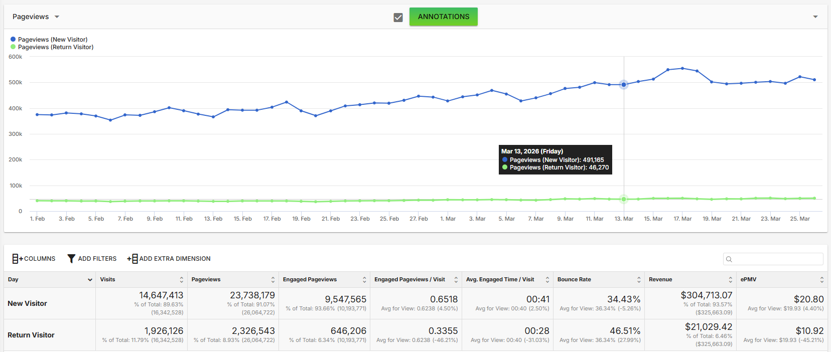
Analyze metrics like return visitor frequency, new vs. returning visitors, navigation bounces, and visit depth.

Return visitor frequency: the percentage of visitors that are returning visitors and how often they return to the site.

New vs. returning: a more granular breakdown of how new visitors and return visitors impact your key metrics.

Navigation bounces: the number of navigation bounces across your entire site.

Visit depth: how far into the pages of your site that a user gets per session.

Content

View metrics like visits, pageviews, engaged time, bounce rate, and revenue by landing pages, pages, and exit pages.

Page Details: See how word count correlates with revenue, EPMV, and bounce rate.

Pages without Revenue: This report allows you to aggregate pages that have not earned any revenue

Article Context: Please see our separate Knowledge Base article on Author Metrics, Published Date, Categories and Content Age

Sites

Compare performance between different sites and subdomains within the Ezoic platform.

Site Speed

Bounce rate by load speed: compare how bounce rate is affected when your site’s load speed is high/medium/low. For example, you can determine how the number of pages viewed per visitor differs depending on whether the page was loaded between 1 - 5 seconds or 5 - 10 seconds. So, in the image below, we can see that when a page loads in 5 seconds or less, the site is likely to obtain a higher number of pageviews:


Pages with redirects: if you have pages that contain redirects, you can compare them to one another, such as how one of your pages with redirects compares with another page with redirects in terms of average pageview duration, or you can view the metrics of individual pages.


Request timing: common speed metrics such as average time to first byte, average time to response end, average time to interactive, average content load time, etc. 


Slowest pages: which pages on your website take the longest to load. By default, these are organized in order of longest load time to shortest.

Caching

Track cache hits and misses, along with other caching performance metrics for your site.

Technology

Device: Navigate to this tab if you’d like to look at various information in relation to each device type, for instance, head to this section if you’d like to see how engaged pageviews are performing on mobile. You’re also able to compare devices here, e.g. compare engaged pageviews between mobile and tablet.


Browser & OS: Here you can look at data by browser (Chrome, Safari, etc.). So, in the example below it's clear that majority of copy & pastes come from users who are using Google Chrome:


Framework: This section provides information regarding PWA, iOS, and AMP specific data.


Connection type: Provides data by connection type (Cellular, Corporate, Cable/DSL, Dialup). In the following image, we can see that users typically view more pages when they are using cable/DSL compared to cellular:


Service provider: This section provides data by service provider (Jio, Comcast Cable, AT&T Wireless, T-Mobile, Vodafone, etc.). Below, we can see that for this particular site, visitors using Jio typically have the highest number of visits and pageviews whereas users using Comcast Cable typically have the highest bounce rate:


Bots: How much bot traffic has been detected on your site.


Connection Effective Type: This section allows you to view a breakdown of the connection type (3G, 4G etc.) of your users.


Traffic Sources

Traffic source: Where all of your traffic comes from in percentage format. Here’s an example below of a site that receives the highest amount of revenue from users coming from Google.com, closely followed by Facebook.com:


Source / medium: Head here if you’d like to look at one particular source of traffic.


Referrals: Here you can look at where all of your referrals come from in number format.


Recommended pages: If you’re using recommended pages, you’ll be able to view the traffic in relation to these pages under this tab.


User Experience

Overview: a broad summary of your site’s user experience metrics (visits, return visitors rate, navigation bounce rate, regular bounce rate, and so on).


By device type UX: a broad summary of your site’s user experience metrics by device (visits, return visitors rate, navigation bounce rate, regular bounce rate, and so on). For example, below, users are most engaged with the page when browsing from a mobile device:


By page UX: a broad summary of your site’s user experience metrics by page and includes all pages of your site (visits, return visitors rate, navigation bounce rate, regular bounce rate, and so on). 


By traffic source UX: a broad summary of your site’s user experience metrics by traffic source. Let’s say you wanted to compare the bounce rate between users that have come from Google and those that have come from Facebook, you can look at that here.


Content viewed percentage: This figure is representative of how far down the page the user is scrolling. So 0 - 10% would mean that the user rarely scrolls below the fold, and 90 - 100% would mean they typically go to the very bottom of the page. We can also see how the scroll percentage relates to data such as pageviews. In the example below, we can see that when the scroll percentage is at its lowest (0 - 10%), the pageviews are at their highest:


Social Shares: This report shows how often individual pages on your website have been shared and the share rate as a percentage of total pageviews.

Yield

Demand Partner


This section allows you to see a breakdown by demand partner, allowing you to see how much revenue you're earning from Google Ad Exchange, AOL, AdSense Mediation, Amazon A9 Header Bidding, etc.


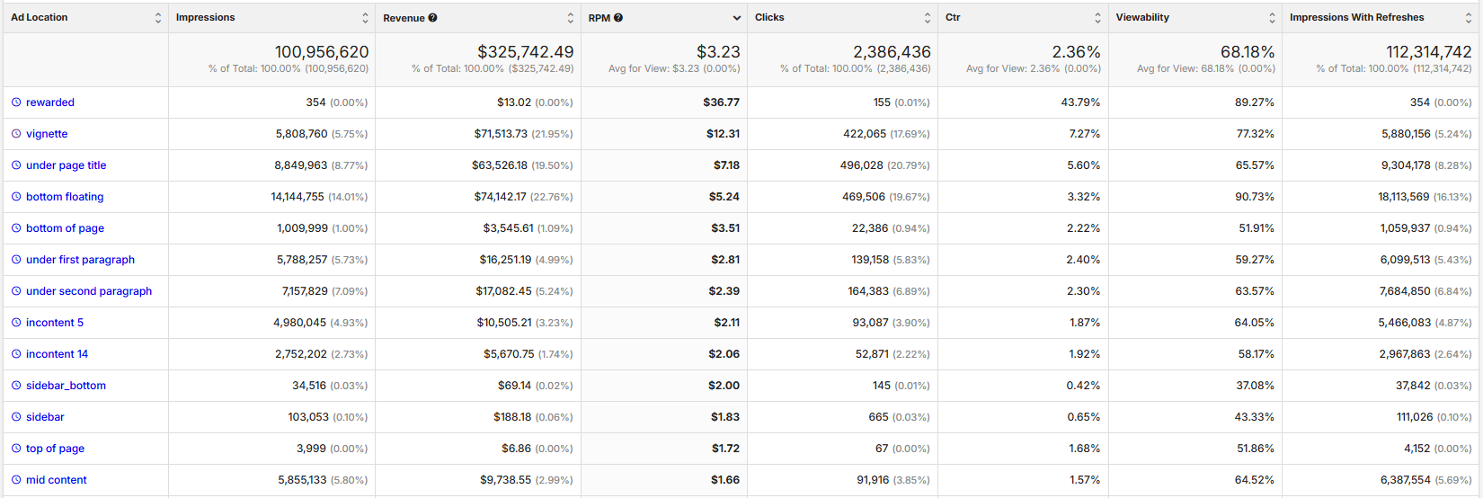
Ad Location


Allows you to see how each of your placeholders is performing by page location.


Ad Placeholder


This view allows you to compare the performance of your various placeholders by their placeholder ID.


Ad Size


Compare performance by ad size (300 x 250, 970 x 250 etc.).


Ads Per Page


This section shows you how your users are interacting with your pages based on the number of ads shown on that page.


Mediation Discrepancy


The discrepancy between what DFP reported vs. what the actual revenue was.


Ad Density


The average percentage of pixels that ads are taking up on an entire page.


SEO

Make sure to link your Google Search Console to Ezoic in order to gain insights into search rankings and their impact on user experience and revenue. Discover what your most valuable keywords are, see what ranking changes could have the largest impact on your site, and uncover opportunities to grow your traffic.

Custom Reports

Save and quickly access any reports you've customized and marked as favorites.

Using Segments

Most sections allow you to view data by segment (like desktop traffic or mobile traffic from the US). Don’t forget to click ‘run report’ after making changes to ensure they are applied.

Adding Filters

Create filters to include or exclude certain days or metrics such as visits, pageviews, bounce rate, etc. You can also drag and drop columns to prioritize the most important metrics.

Video

Tips and Best Practices

When using the Big Data Analytics Dashboard, consider the following best practices to optimize your experience and make the most of the data available:

  1. Select Relevant Platforms: Always ensure that you have selected the correct platform (pre-Ezoic, Ezoic, or both) to obtain the most meaningful data comparisons.
  2. Utilize Favorites: Add frequently accessed reports to your favorites by clicking the 'star' icon. This will save time and streamline your workflow.
  3. Leverage Help and Search Features: Utilize the 'help' button and the search bar to quickly find relevant support articles and specific reports, respectively.
  4. Customize Date Ranges: Use custom date ranges to analyze data over specific periods. This is particularly useful for comparing revenue and traffic trends year-over-year.
  5. Understand Your Audience: Regularly check the 'Audience' section to gather insights on demographics, language, location, and user engagement times. This will help tailor your content to your audience's preferences.
  6. Monitor Site Speed: Keep an eye on the 'Site Speed' reports. Understanding how load times affect bounce rates and pageviews can guide improvements to your website performance.
  7. Analyze Traffic Sources: Use the 'Traffic Sources' section to understand where your traffic is coming from. This information is crucial for refining marketing strategies and identifying key referral sources.
  8. Segment Your Data: Utilize segments to view data for specific groups, such as desktop users or mobile users from a particular region. This will help in making more targeted decisions.
  9. Apply Filters: Create and apply filters to isolate specific metrics or date ranges. This will help in focusing on the most relevant data without getting overwhelmed by other metrics.

By following these best practices, you can effectively harness the power of the Big Data Analytics Dashboard to make data-driven decisions and optimize your site's performance.

Loading ...